Packaging
Refresh
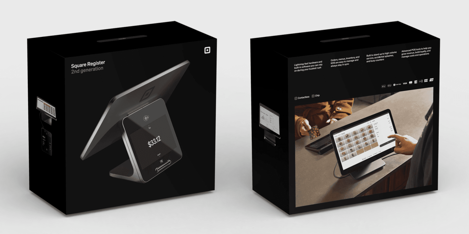
Despite a full portfolio of POS devices, Square had never created a holistic packaging system that gave sellers a consistent brand experience. Each device and its unboxing had a different look and feel, along with a different range of messaging.
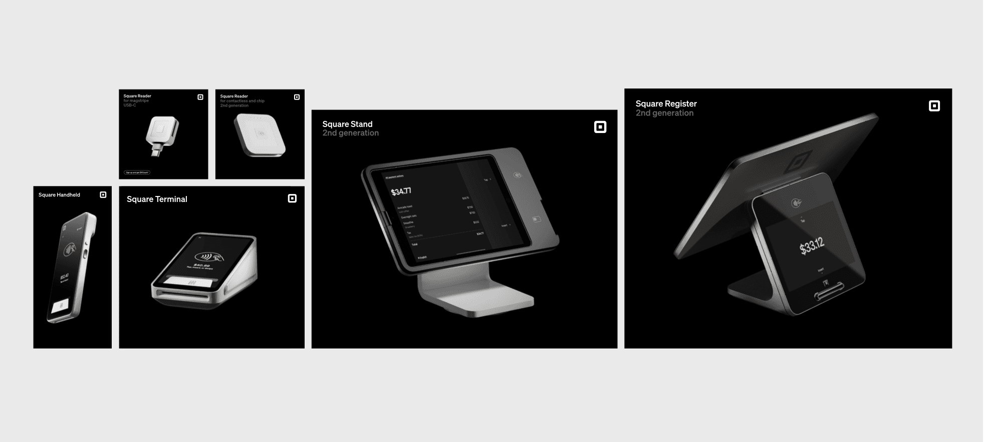
When we launched Square Register (2nd generation), we committed to a total reinvent of packaging for all devices (a total of 6) both for in-store purchases and also direct to consumer. Packaging is unique in that it is both pre- and post-purchase, so the level of information had to be exact and the visuals had to highlight major jobs to be done, priority seller types, and the premium industrial design. And we had no budget.
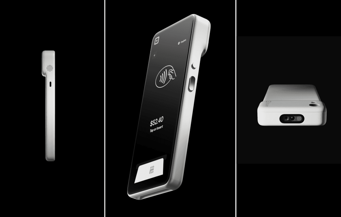
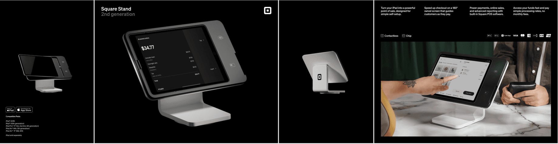
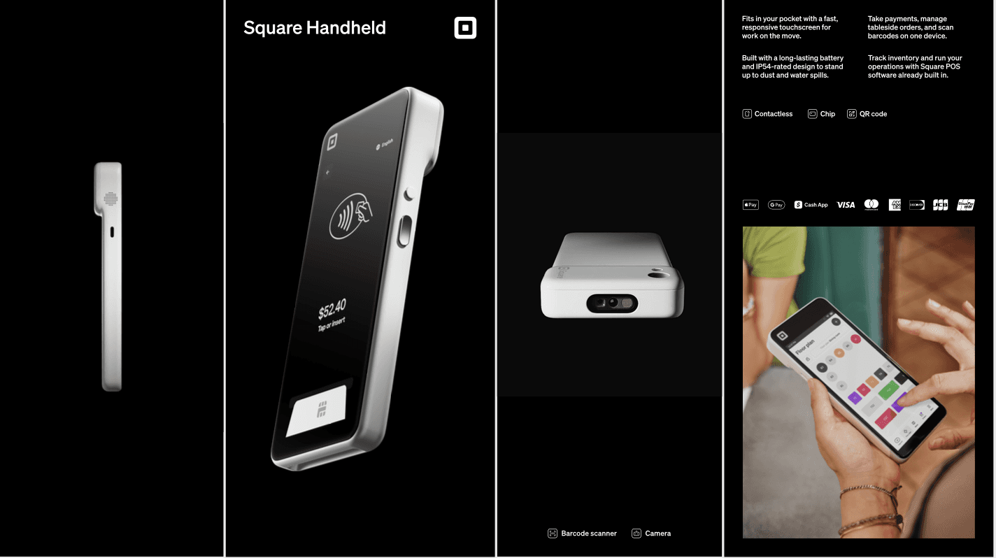
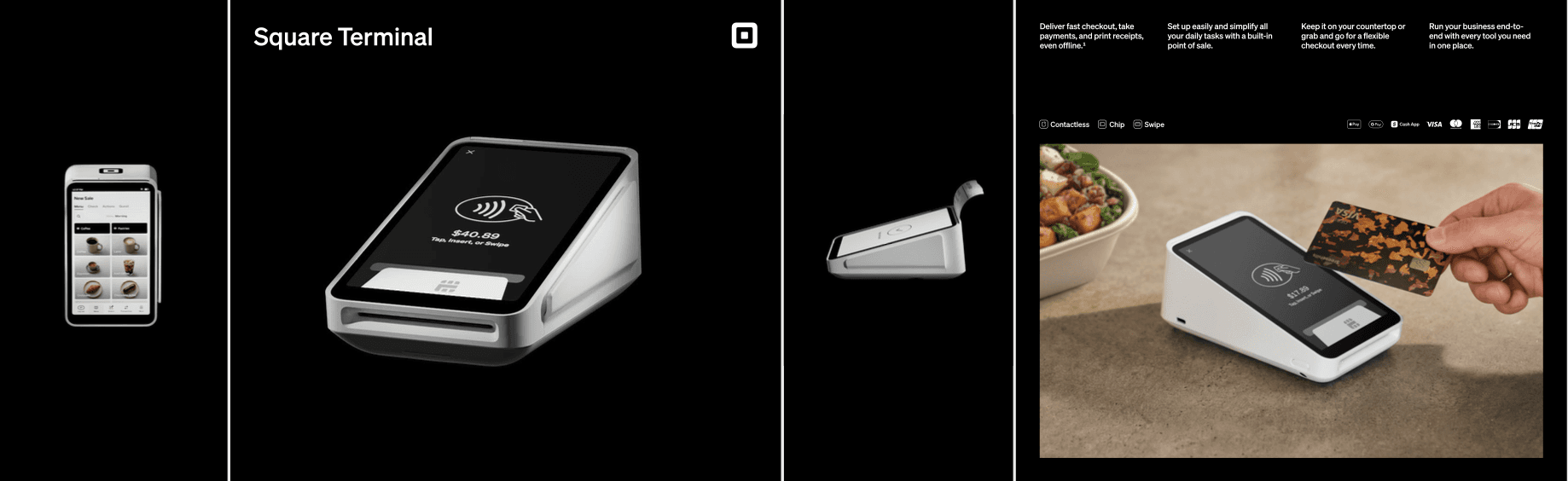
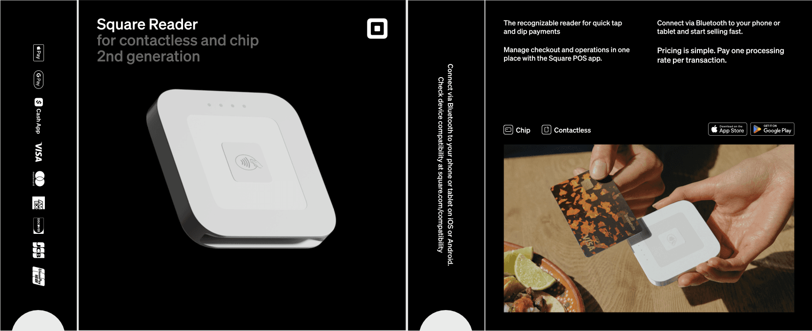
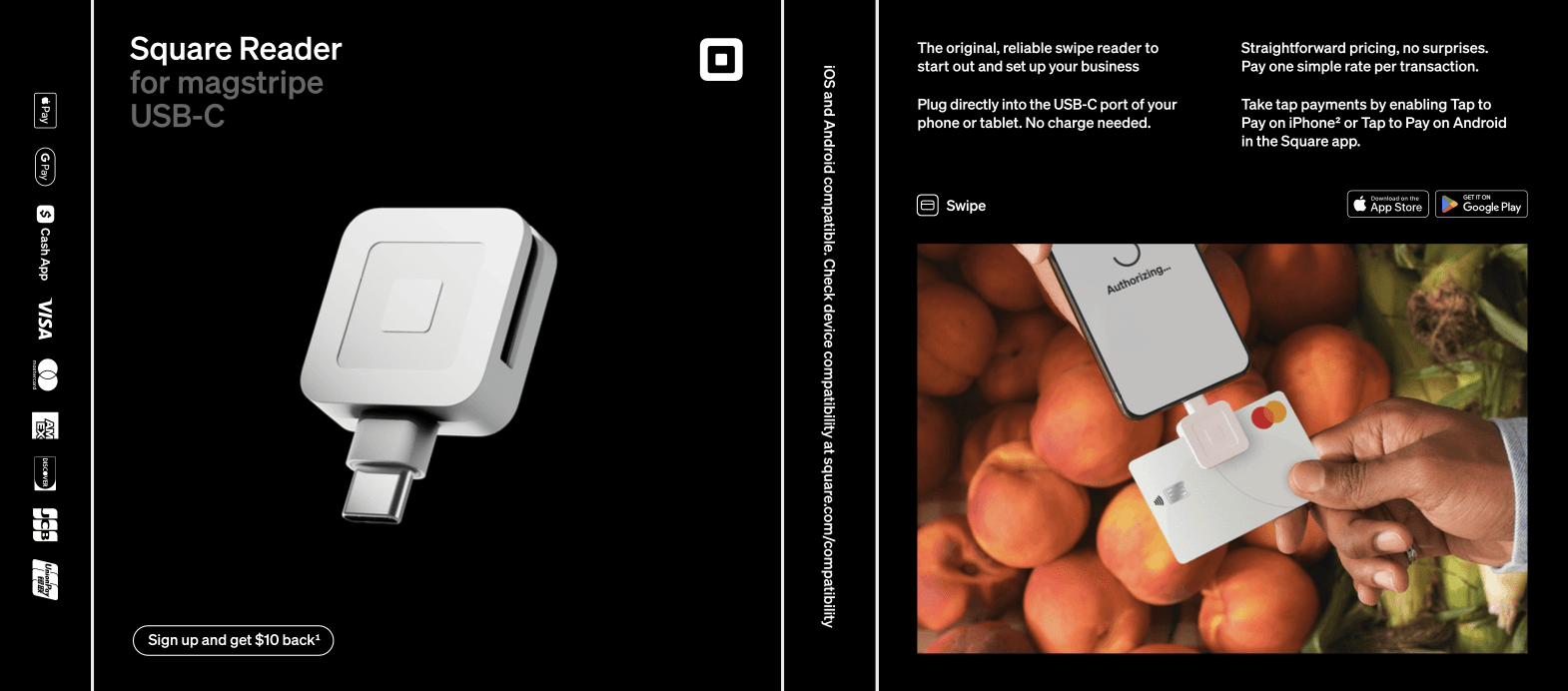
First, we made sure every render featured had a unique point of view, showing off the right angles of the device and drawing attention to the stunning form factor. We played with more dramatic shadows and angles, while still focusing on the features important to sellers.
In-situ stills
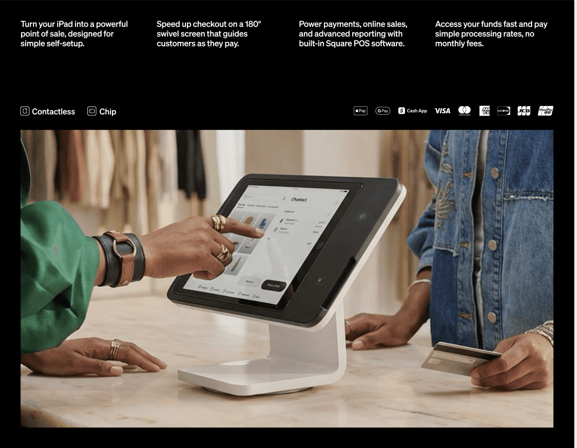
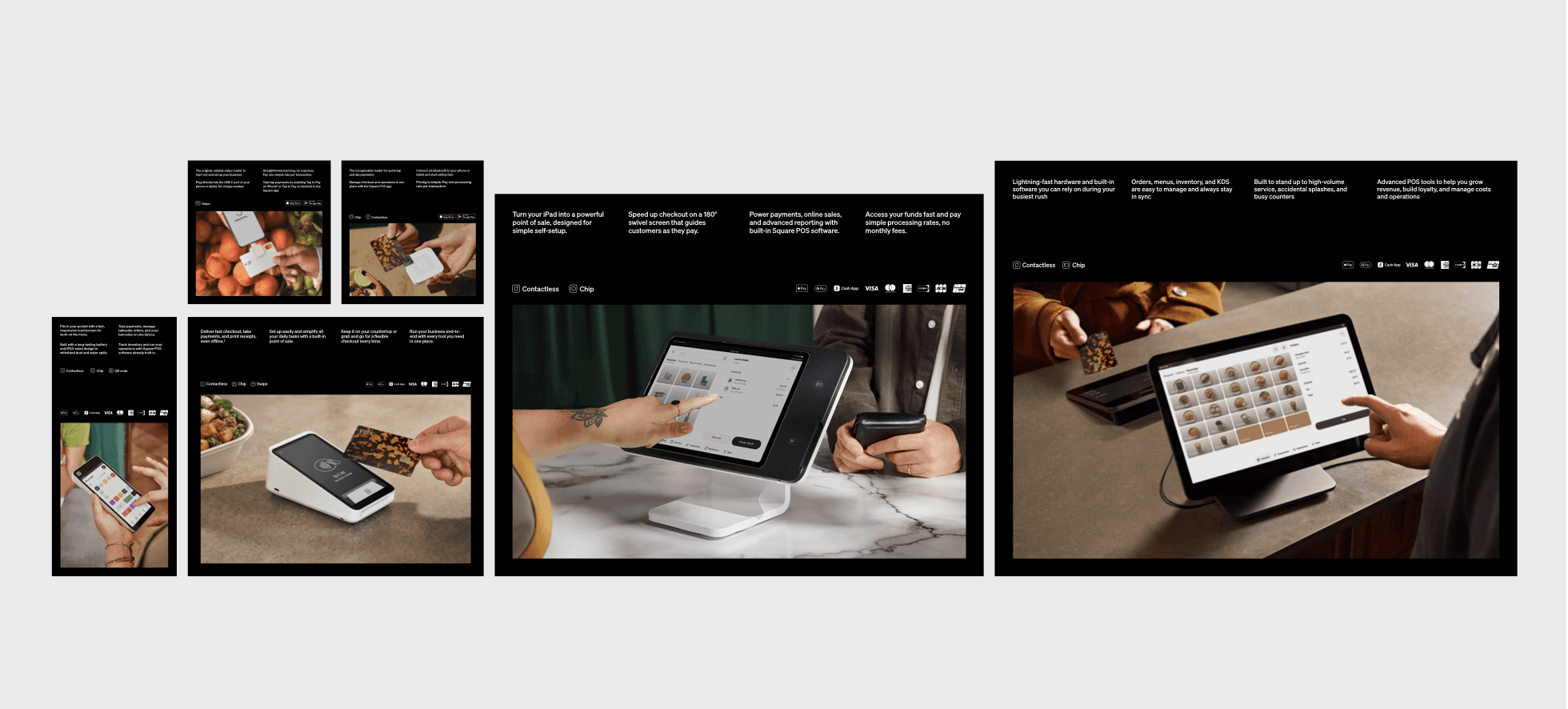
We had no money for a shoot, but we knew from extensive testing and research that sellers love the look of Square hardware but they also want context. We needed an in-situ moment on packaging that wouldn't feel dated but that would also show the scale and use case (countertop vs. handheld) of each device.
We found existing images that worked with a lot of retouching so I also generated images for each device using Runway. This marked our first foray into AI-generated stills for functional moments like payments.
Packaging
Packaging
Refresh
Despite a full portfolio of POS devices, Square had never created a holistic packaging system that gave sellers a consistent brand experience. Each device and its unboxing had a different look and feel, along with a different range of messaging.
When we launched Square Register (2nd generation), we committed to a total reinvent of packaging for all devices (a total of 6) both for in-store purchases and also direct to consumer. Packaging is unique in that it is both pre- and post-purchase, so the level of information had to be exact and the visuals had to highlight major jobs to be done, priority seller types, and the premium industrial design. And we had no budget.
Up-leveled renders
First, we made sure every render featured had a unique point of view, showing off the right angles of the device and drawing attention to the stunning form factor. We played with more dramatic shadows and angles, while still focusing on the features important to sellers.
In-situ stills
We had no money for a shoot, but we knew from extensive testing and research that sellers love the look of Square hardware but they also want context. We needed an in-situ moment on packaging that wouldn't feel dated but that would also show the scale and use case (countertop vs. handheld) of each device.
We found existing images that worked with a lot of retouching so I also generated images for each device using Runway. This marked our first foray into AI-generated stills for functional moments like payments.
On-device screens
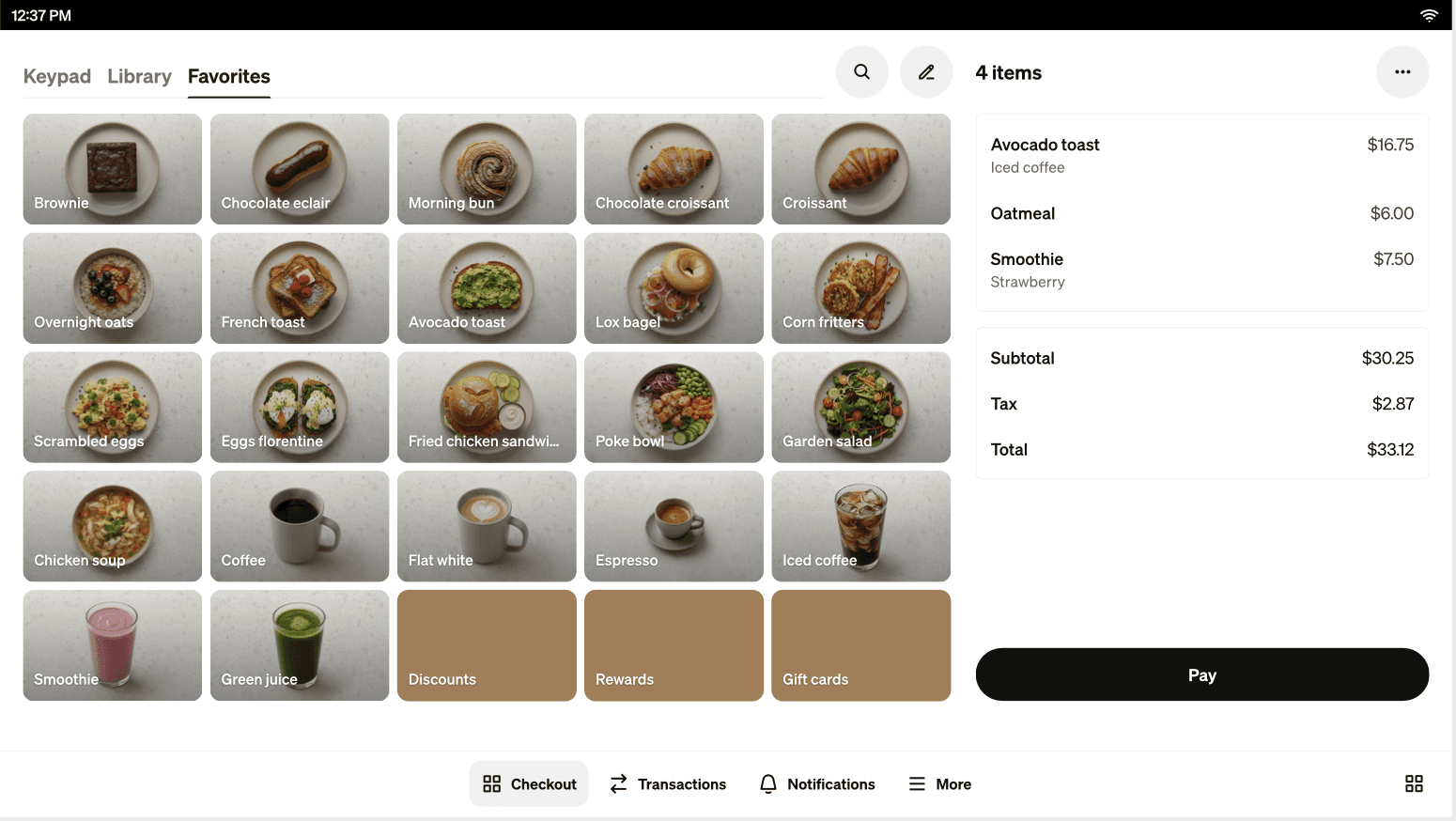
Every detail on this packaging needed to feel curated, special, and relevant, so we also leveraged AI to create bespoke menu and item libraries. This let us respond to specific market needs in a more agile way and also ensure the screens did not distract from the product or story.
Surprise & delight
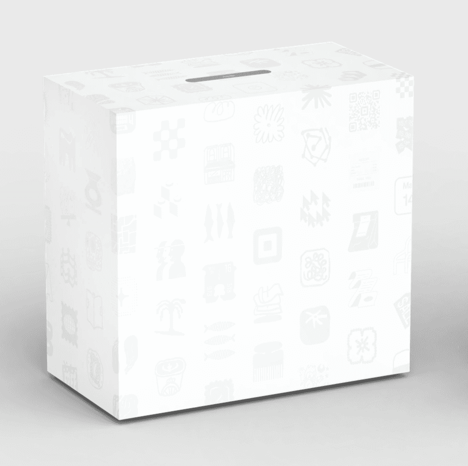
Once we had the formula for the outer sleeve, we focused on the inner box. We felt strongly that this should be elevated and highly branded. We landed on a staggered glyph design printed directly on the box.
This design flexes across all box sizes, always showcasing the jewel at the center. The smallest readers only show off one glyph but still feel at home within the system.
We loved the idea of a seller taking off the outer sleeve and feeling delighted by the Square brand,
Inside the box
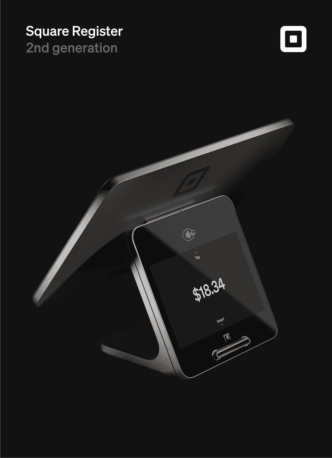
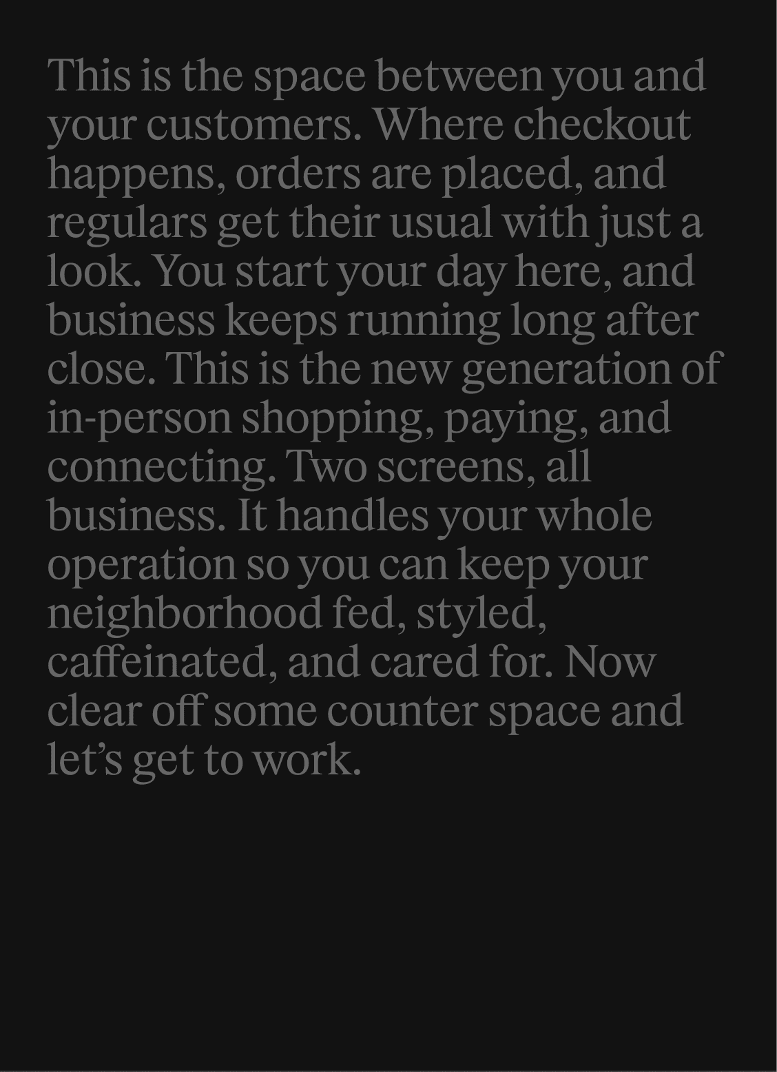
Our main aim inside the box was to confirm to sellers that they had made the right choice investing in Square. The setup guides for every device were inconsistent in material, visual, tone, and information. They needed an overhaul.
We streamlined the content in those guides so that nothing was redundant with the tour sellers would receive on the software of their actual devices. We removed any upsell moments and focused only on educational device content. We refined the technical illustrations to feel more premium. And we picked up key elements of the outer sleeve design to tie it all together. Each guide ends with a product manifesto to get sellers energized about doing business with Square.
Final sleeves
System at a glance
On-device screens
On-device screens
Every detail on this packaging needed to feel curated, special, and relevant, so we also leveraged AI to create bespoke menu and item libraries. This let us respond to specific market needs in a more agile way and also ensure the screens did not distract from the product or story.
Surprise & delight
Once we had the formula for the outer sleeve, we focused on the inner box. We felt strongly this should feel elevated but highly branded. We landed on a staggered glyph design printed directly on the box.
This design flexes across all box sizes, always showcasing the jewel at the center. The smallest readers only show off one glyph but still feel at home within the system.
We loved the idea of a seller taking off the outer sleeve and being delighted by this branded moment.
Surprise & delight
Surprise & delight
Once we had the formula for the outer sleeve, we focused on the inner box. We felt strongly that this should be elevated and highly branded. We landed on a staggered glyph design printed directly on the box.
This design flexes across all box sizes, always showcasing the jewel at the center. The smallest readers only show off one glyph but still feel at home within the system.
We loved the idea of a seller taking off the outer sleeve and feeling delighted by the Square brand,
Our main aim inside the box was that sellers felt they had made the right choice going with Square. The setup guides for every device were inconsistent in size, tone, and information. We overhauled them all and created another system for these guides. We streamlined the content in those guides to what's in the box, how to set up the device, Wi-Fi and accessories information, and any additional device nuances, like pairing with Tap to Pay. We mirrored the render on the front of the packaging sleeve and ended each guide with a branded moment. We rallied around Square's mission of connecting the neighborhood and crafted a manifesto for each device.
Inside the box
Final sleeves
System at a glance
First, we made sure every render featured had a unique point of view, showing off the right angles of the device and drawing attention to the stunning form factor. We played with more dramatic shadows and angles, while still focusing on the features important to sellers.
Up-leveled renders
In-situ stills
We had no money for a shoot, but we knew from extensive testing and research that sellers love the look of Square hardware but they also want context. We needed an in-situ moment on packaging that wouldn't feel dated but that would also show the scale and use case (countertop vs. handheld) of each device.
We found existing images that worked with a lot of retouching so I also generated images for each device using Runway. This marked our first foray into AI-generated stills for functional moments like payments.
On-device screens
Every detail on this packaging needed to feel curated, special, and relevant, so we also leveraged AI to create bespoke menu and item libraries. This let us respond to specific market needs in a more agile way and also ensure the screens did not distract from the product or story.
Surprise & delight
Once we had the formula for the outer sleeve, we focused on the inner box. We felt strongly that this should be elevated and highly branded. We landed on a staggered glyph design printed directly on the box.
This design flexes across all box sizes, always showcasing the jewel at the center. The smallest readers only show off one glyph but still feel at home within the system.
We loved the idea of a seller taking off the outer sleeve and feeling delighted by the Square brand,
Our main aim inside the box was to confirm to sellers that they had made the right choice investing in Square. The setup guides for every device were inconsistent in material, visual, tone, and information. They needed an overhaul.
We streamlined the content in those guides so that nothing was redundant with the tour sellers would receive on the software of their actual devices. We removed any upsell moments and focused only on educational device content. We refined the technical illustrations to feel more premium. And we picked up key elements of the outer sleeve design to tie it all together. Each guide ends with a product manifesto to get sellers energized about doing business with Square.
Inside the box